quinnipiac alumni website redesign
The motivation of this community is to continue the relationship between the university and students after they graduate. The association offers online career webinars, alumni events, making a contribution to the school, or mentoring a current student. Their website states, "we understand that we are strongest as a connected and committed alumni community."
site overview
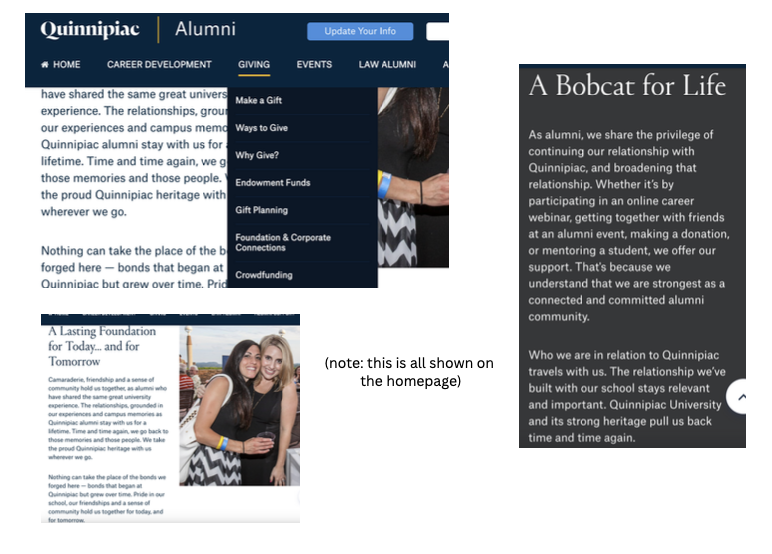
The layout of the website is cohesive, with the continuing theme of blue, white, grey, and gold. It seems to follow the university branding which is imperative.
Where they begin to lose their audience is the over-abundance of information...There are five additional tabs on the home page: career development, giving, events, law alumni, and alumni support with at least 7-8 sub-tabs underneath. Under giving there are essentially five tabs informing you on how/where to give, which seems completely unnecessary.
Additionally, it's important to note that the homepage has its user scroll about 6 times down to get to the bottom of the page.
The overall consensus is that the website offers a lot of valuable information, but is all of it really needed?
marketing & user requirements
Although this website isn't consumer-based, they still need to be selling their brand and it's evident they are not. The message they should be conveying is keeping alumni connected to the university. However, there aren't any substantial ways they are offering to keep the alumni connected.
There needs to be a priority on what information on the homepage is most relevant. The page is consumed by so much text and information you're not sure what you should be engaged in. It would be worth relocating some of this information under one of the website's header tabs.
In terms of user requirements, including an alumni forum or blog could drive more activity on this website. As well as an alumni gallery from events. Alumni Associations are all about community so it's crucial this website feels like a community to it's users.
comparative analysis
The Quinnipiac Alumni site follows consistent patterns that are seen among other sites, such as including an events calendar and alumni stories. However, it is missing some crucial items design-wise. The largest issues at hand are the lack of direction and theme. Although it isn't a consumer-based site there should be something they are trying to sell or a point they're trying to get across.
The Rutgers Alumni Association website does a great job conveying its overall message. They offer easy navigation, as well as provide unique features such as trendy social posts. Both these factors are easy fixes on Quinnipiac's end. If Quinnipiac we're to provide more interactive features, it would find users visiting the site more frequently.
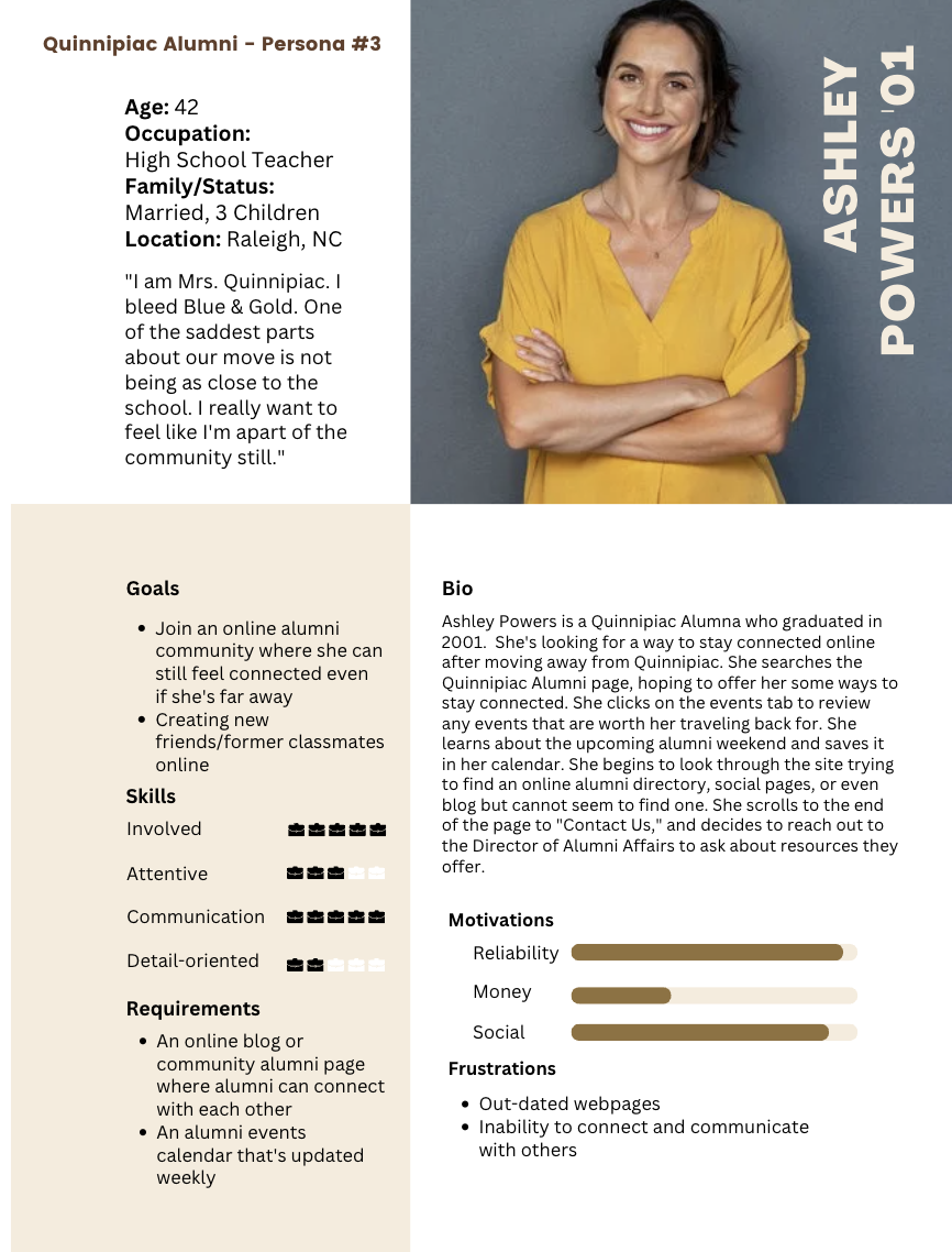
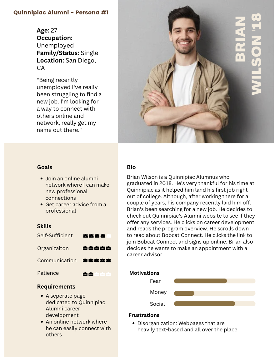
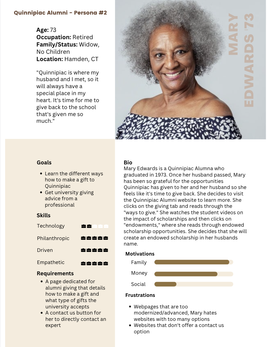
user personas
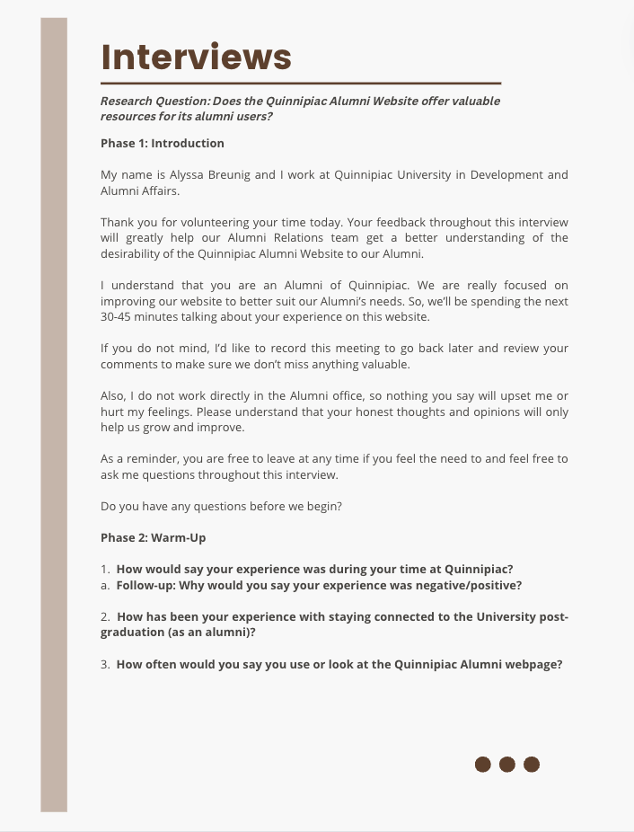
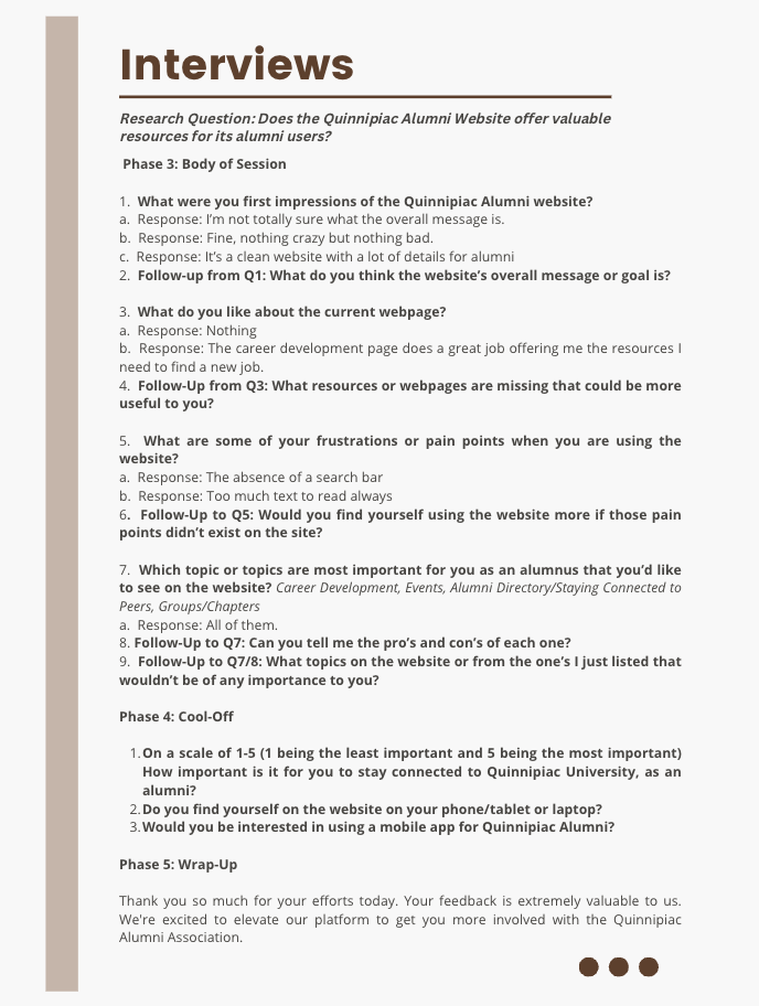
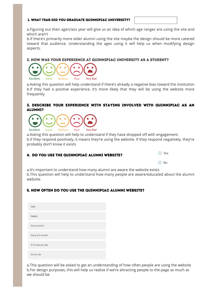
interviews & survey
card sorting report
The motivation of this website is to continue that relationship between the university and those students long after they graduate. In recent years, the alumni association has found that fewer individuals view the website.
While we are working on upgrading the website to be more appealing to the user, we've decided to develop a card-sorting report to understand the way users think about our content.
card sorting report findings
It took our five participants a median time of 4:30 to complete our study. The longest time was 6:53 and the shortest was 3:04. The participants created a total of 31 categories, with a median of 7 categories each.
Common similarities in group categories we're labeled as "Alumni, Career or Jobs, Connect or Stay Connected, Contact or Contact Info, and Law Alumni.
The card sorting data was analyzed by a Similarity Matrix Analysis program to derive the overall sort shown in Figure B. The figure shows the composite sort of all 20 cards for all 5 participants. The closer the concepts are to each other on the sorting diagram, the more conceptually related they are. This figure can serve as a guide for determining the new menu structure.
Overall, our team found this exercise extremely beneficial in terms of understanding our user's navigation process. We have learned valuable tools that will directly apply improvements to our website.
usability testing
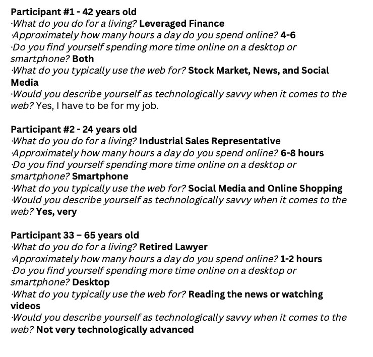
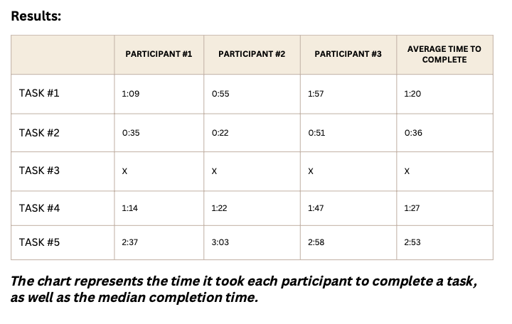
In our usability test sessions, three participants were given five tasks to complete on the Quinnipiac Alumni website. These tests were conducted and observed to better understand how real users interact with our website. These sessions were imperative in understanding the website's areas of confusion and providing opportunities to improve the overall user experience.
To best understand the overall user experience, both quantitative and qualitative data were collected in these studies. Participants were timed and asked to express their thought processes aloud.
usability testing results
From these usability test sessions, it's evident that the overall navigation and readability throughout the site is promising. However, there are some notable issues that we're addressed by participants that should be taken into account.
The website is text-heavy
Multiple times throughout the study we found users skipping over long-worded sections looking for key indicators of the task. In order to improve the visual appearance of the website it's important to reduce or remove excessive text.
The navigation bar can be improved
Users we're often clicking through the different tabs trying to find the correct one they should direct their attention to. Creating more understandable and cohesive navigation titles would be beneficial.
Correcting buttons/tabs that lead to nowhere
Users we're frustrated when the tab they clicked on either lead them to a page that no longer exists or the incorrect page. One example of this happening was when they we're instructed to "Join a Giving Society."
Including a Search Bar
Participants noted that having a search bar would have made completing the tasks much more efficient.
Making the "Contact Us" tab more prominent
During this task, users found themselves struggling to figure out who or how to contact for information. An alumni website must have a more accessible way for users to contact if they have questions
executive summary
In conclusion, the Quinnipiac Alumni Association overall goal is maintaining the connection between alumni and the university. It's imperative that the Quinnipiac Alumni Website is a representation of that connection and community, both fundamentally and visually.
The usability of the website is satisfactory, there isn't too many technical issues. However, issues that presented itself in the usability study we're: navigation bar being too complex, click-off buttons directing to a page that no longer exists, lack of contact information, missing search bar made difficulty completing tasks, and abundance of text.
The overall navigation needs minor improvements. From our card-sorting tests we found that users found that certain navigation categories would be better pieced together than presented on the website. Multiple users requested including more tabs such as, "Associations/Groups" and "Stay Connected."
In terms of desirability this is where the site needs to make necessary improvements. From the studies conducted, users made several comments of the text-heavy pages, lack of images, and lack of interactive engagement. It's imperative that the organization run tests (desirability tests and/or five second tests) to grasp an overall understanding of the desirability of it's users.
As stated in the Comparative Analysis, including a search bar on the website is crucial when all other competitors have one. As well as a "Stay Connected," button allowing users to sign up for emails about events, news, etc.
The site is meant to be engaging, so it's important to prioritize the engaging aspects of the website. Examples include: moving the alumni stories higher on the homepage, make events easier to find, include more images of alumni. The website is an online community for it's alumni, it's essential to present it that way.


