foam brewers website redesign
In 2021, craft brewery sales rose 8 percent to 24.8 million barrels. The market for craft beer is certainly high, so how can one brewery stand out amongst the almost 10,000 breweries in the US? It’s simple, with a strategic marketing plan.
It’s very rare to see service industries devoting their time to promote their brand, but in the age of technology there’s so much success in creating a well-known name for your company.
Foam Brewery, located on the Burlington VT waterfront, prides themselves in “being a small independent brewery crafting imaginative beers for enlightened palates.”
This campaign below (consisting of a mood board, color palette, site map, and wireframes) was created to develop a strategic website design and plan to elevate Foam Brewers brand image and awareness.
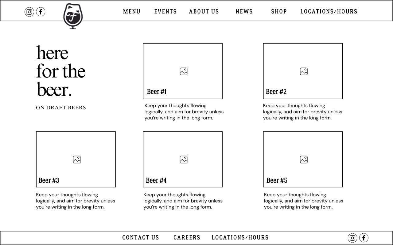
wireframe
A website wireframe is the bread that holds the sandwich together. It’s a very simplified layout for a website that outlines the structure of the company’s website. Creating a wireframe is the first step needed in designing a website with great user experience.
For Foam’s website wireframe, the layout created shows both the main home page and the beer page. Most breweries just have pictures of the beer and don’t tell the story. We emphasize the importance of community for this brand and having a website with more stories and descriptions only adds to that community factor.
moodboard
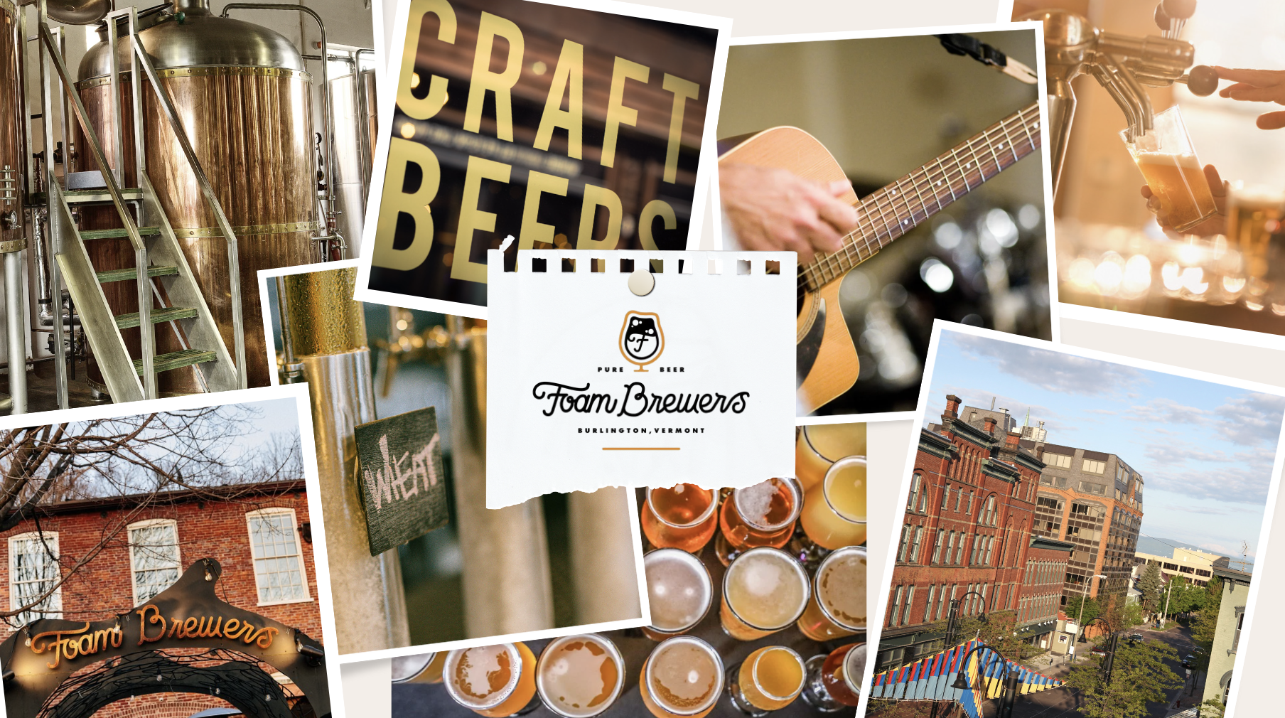
A mood board is visual inspiration that defines your brand. What visual assets (colors, images, photos, etc) embody who you are and what message you want to convey. That’s why creating a mood board was a crucial first step in understanding brand identity, specifically for Foam Brewers.
Burlington Vermont is the epitome of everything you want to experience in a brewery. The landscape, the character, the community, the live music, and the carefully crafted beer.
This mood board is a representation of all those things. Community is such an integral part of both Burlington’s and Foam’s culture. It’s a warm and welcoming place, and that’s why I made sure to use warm colors to promote that message.
color palette
The next step of the brand campaign is creating a color palette. A color palette includes a set of colors, known as a color scheme, that represents your brand’s visual identity. According to some studies, 84.7% of consumers say that “color” is their primary reason for buying a specific product. This step is not to be taken lightly or done last minute.
By assigning a color palette to your website, merchandise, beer cans, logos, you’re creating psychological connections (could be good or bad) with your consumers. You’d be surprised how many breweries have inconsistent and unattractive color schemes.
It’s important to note that colors evoke emotion and Foam must continue that warm and welcoming emotion within their visual color palette. The warm browns are to yes, symbolize the color of beer, but also these colors correlate to the colors of the earth (trees, soil, leaves).
site map
Every great website starts with a site map. A site map is the blue print of your website that helps you organize content, create fluid navigation, and improve SEO. It lists all pages of a website and connects how they’re related to each other.
The layout of the Foam Brewers website is quite simple. There isn’t too much navigating out of the subpages, only when using the “shop,” “available cans,” and “contact” features.
I wanted to make the website more interactive for the user so I added in a couple of user-focused features (i.e. blogs, careers, social media, contact us).


