website analysis comparison
The New York Times (NYT) and the British Broadcasting Corporation (BBC) are both well-known newspapers that offer considerable local and global coverage. The NY Times has a larger emphasis on US news whereas BBC covers England, as well as a far wider international reach. As a 21st-century society we claim that news companies are “dying,” due to this it’s evident that there’s a growing importance that news outlets rely heavily on their internet presence.
As a daily news reader, I myself, am a continuous online NY Times reader. What works for the NY Times is the visual simplicity, there are no extravagant colors (it’s solely black and white), the white space on the sides helps relieve eye strain, and its best feature … little to no ads. BBC, on the other hand, is covered in ads. If you’re interested in information overload and chaos, then this site is one for you.
Throughout this analysis, I will elaborate on the stark differences between both news outlets, as well as the feelings and needs of each site's UI and UX.

ux: landing page
The initial landing page of the NY Times makes me feel STIMULATED and SATISFIED because my need for SPACIOUSNESS and PURPOSE is met.
The visual simplicity of the NY Times landing page is a large reason I continue to use the website. Its minimal aesthetic does not bombard or overwhelm the user. Unlike most websites, they veer away from the ad and information overload. The black and white tones, as well as the blank space, present the site as clean and refreshing. Overall, extremely visually appealing.
ux: an article
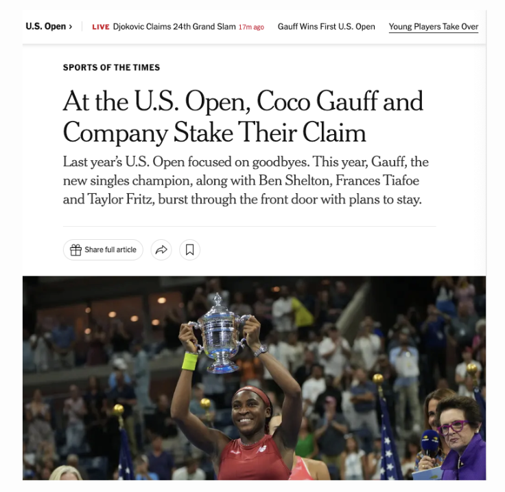
When reading an article in the NY Times I feel ABSORBED and INVIGORATED because my need for FLOW, CREATIVITY, and LEARNING is met. NY Times offers a very accessible writing style, it is very casual but also educational.
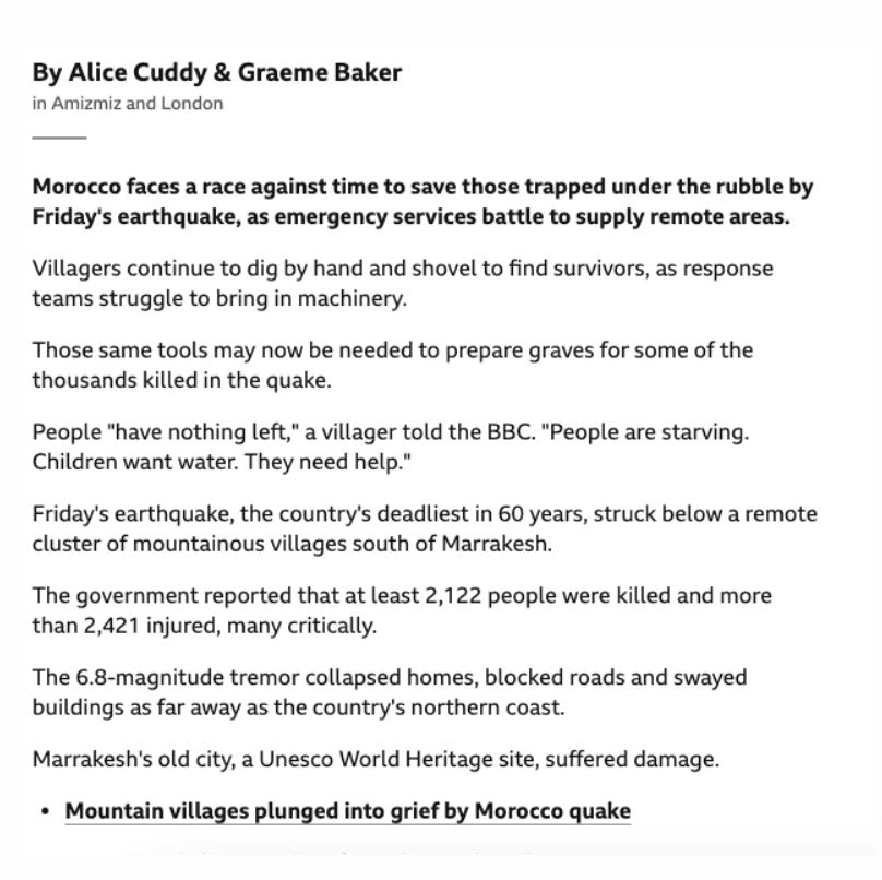
Each article also provides high-quality images that perfectly illustrate the writing. The layout of the images on the page nicely breaks up the text from being too long. The headline and byline are effective in peaking a user’s interest
ux: headlines
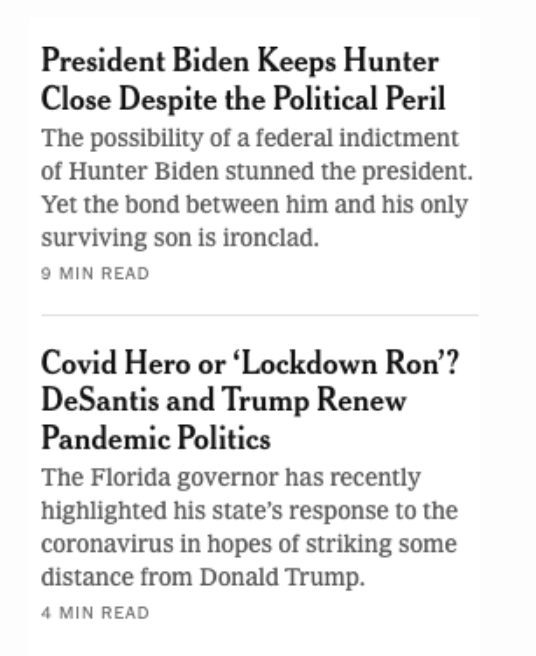
The headlines for the NY Times make me feel ENCOURAGED and INSPIRED because my need for STIMULATION and CHOICE is met.
The news outlet provides both catchy and accurate headlines. I don’t feel misled or confused when clicking an article based on its headline. The headlines are intriguing and informative, which as a continuous user I find very helpful.
ui: navigation & usability
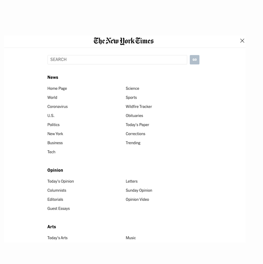
The navigation on the NY Times website makes me feel CONFIDENT because my need for COOPERATION and FLOW is met.
The NY Times makes it easy to move between sections, even offering other related stories you may be interested in. They also provide a top bar, footer containing links to other categories, and search bar.
The usability of the site makes me feel CONTENT and APPRECIATIVE because my need for EASE and EFFECTIVENESS is met.
The website is ergonomic, meaning it can be used properly on a computer, tablet, or mobile device. It’s also accessible to all ages.

ux: landing page
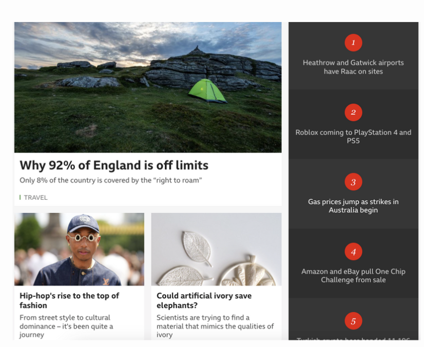
The BBC Landing Page makes me feel OVERWHELMED and WITHDRAWN because my need for SPACE and CLARITY is not met.
The page is cluttered with ads that navigate to outside sources, essentially making the reader question its authenticity (whether it's legit or spam). In addition, the limited white space and use of numerous colors make the overall visuals very disengaging. Personally, I find myself constantly distracted on this website, taking away from the task at hand..
ux: an article
Reading an article on the BBC makes me feel AGITATED and PERPLEXED because my need for AWARENESS and CREATIVITY is not met.
The BBC is centered around fast and abundant news reporting, so there isn’t much substance for the reader. The images are low-quality and repetitive. I will say, it is very accessible to readers of all ages. If you’re interested in news articles that are very minimal and not in-depth then this may be the right news outlet for you.
ux: headlines
The BBC headlines make me feel DISCOURAGED, UNEASY, AND IRRITATED because my need for COMMUNICATION AND INTEGRITY is not met.
If a user isn’t very informed on the topic of an article they will have no idea what the article is about based on the headlines. BBC offers several misleading headlines, essentially risking a negative experience for its users. Some titles don’t even reflect the story accurately. It’s a balancing act between catchy and reliable headlines, the BBC is unable to do so.
ui: navigation & usability
BBC’s navigation makes me feel ANNOYED and HOPELESS because my need for COOPERATION and EASE is not met.
The site offers one primary navigation tab with no subcategories provided, so if your interest doesn’t fit one of the 5-7 tabes offered then hopefully its offered via the search bar.
The usability of the BBC website makes me feel INDIFFERENT and WITHDRAWN because my need for MOVEMENT and TRANSPARENCY is not met.
The layout and navigation aren’t very coherent so the user’s ability to complete tasks is often delayed or non-existent.


